December 16, 2015
Frank Gehry
21_21 Design Sight examines the work of the wild man of architecture
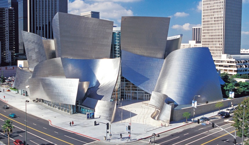
The “Bilbao Effect” is a term used to describe the revitalization that occurs when a new, eye-catching piece of architecture brings new visitors and businesses to a city. It’s named after the Spanish city of Bilbao, which was reportedly revived by the construction of the iconic Guggenheim Museum there.
(Photo by John B. Carnett/Bonnier Corporation via Getty Images)
The architect behind this building and many others, Frank Gehry, is now the subject of the latest exhibition at 21_21 Design Sight. The show, “Frank Gehry: I Have an Idea,” is an attempt to explore Gehry’s creative processes. No doubt, part of this interest is motivated by a desire to seek economic stimulus through urban redevelopment, as Japan’s sluggish economy tries to gear up for the coming Olympic Games. Although the fallout from the Olympic Stadium design fracas with Zaha Hadid reveals the ambivalence Japan feels for foreign “starchitects” like Gehry.
Perhaps this is the reason the exhibition plays it rather safe. Curated by exhibition director Tsuyoshi Tane, the show focuses on the often banal and mundane details of Gehry’s project developments. Rather than mercurial leaps of imagination, Gehry seems to operate through a restless and somewhat chaotic sifting of ideas, using various mockups that can then feed into a critical evaluation and fine-tuning of the final idea.
What strikes the visitor is how Gehry uses quite old-fashioned methods to get where he’s going. As Gehry says in one of the information boards in the exhibition, “I don’t like drawings in the computer. They’re a turnoff for me.” Instead, Gehry only uses computers after the design process is complete to give precise instructions to the builder “with no chance for a misunderstanding.”
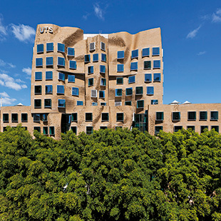
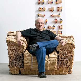
(Photo by Andrew Worssam)
The fact that Gehry works in this way makes this a far better exhibition than if he was more computer-savvy, because it gives us plenty of drawings, 3-D mockups, and other items to look at. Gehry’s initial drawings are very rough, squiggles and doodles. He also resorts to crumpled-up balls of paper and cardboard boxes thrown together to explore an idea.
The importance of chaotic trial and error is signified by his “manifesto.” This is printed on what looks like a giant crumpled-up piece of paper, smoothed out. This “document,” however, provides few clues with its rambling message.
The main sense that one gets of Gehry from this exhibition is that of a man with a restless and irritable energy. There’s even a hint of self-loathing and disdain for his chosen profession. We get a feeling that while he’s designing buildings, he’s also wishing to destroy them—like a cross between Frank Lloyd Wright and Godzilla. This would explain some of his more breathtaking designs, like that for the Cleveland Clinic Lou Ruvo Center for Brain Health, prominently represented here by several models, mockups, and other materials.
This, like his famous Bilbao Guggenheim, seems to be a building in a state of collapse, throwing itself into a random but pleasing pattern of chaos. Perhaps it’s distorted to fit in with the confused perceptions of the severely mentally ill that it caters to.
Whatever its appeal, this building is certainly not reassuring. And one suspects the same is true of Gehry, the pedantic wild man of architecture, constantly throwing things in the waste paper basket and taking them out again.
21_21 Design Sight, until Feb 7. www.2121designsight.jp/en/

