June 24, 2025
Why Wooden Architecture Is Making a Comeback in Japan
The “woodification” of Japanese skyscrapers is a testament to innovation and offers hope for a greener construction industry
By Gendel Gento
Wooden architecture in Japan is reaching for the skies. Often reserved for low-rise buildings, timber is finding its way into taller and larger structures. As the country aims to cut carbon emissions by 60% by 2030 and reach net zero by 2050, wood is re-emerging as a green alternative to steel and concrete.
Japan’s forestry policy promotes responsible harvesting and replanting to balance timber production and ecosystem health. With forests covering 67% of the country, harvesting mature trees and replanting younger ones boosts carbon absorption and biodiversity. As trees age, they absorb less CO2, so harvesting them could actually boost climate change efforts.
Timber certification programs, such as those under the Forest Stewardship Council (FSC) and the Sustainable Green Ecosystem Council (SGEC), ensure that construction timber comes from well-managed forests. This creates a closed-loop system where forest resources are renewed and preserved for future generations. Japan’s locally produced timber reduces its carbon footprint associated with importing materials.
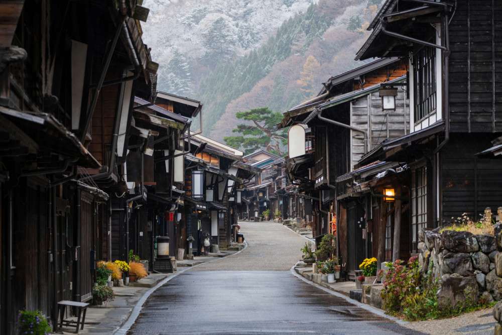
Timber has shaped traditional Japanese architecture for centuries, but postwar reconstruction favored cement and metal, especially for earthquake-resistant skyscrapers. Today, technological advancements and the push for sustainability are making high-rise wooden buildings an appealing option.
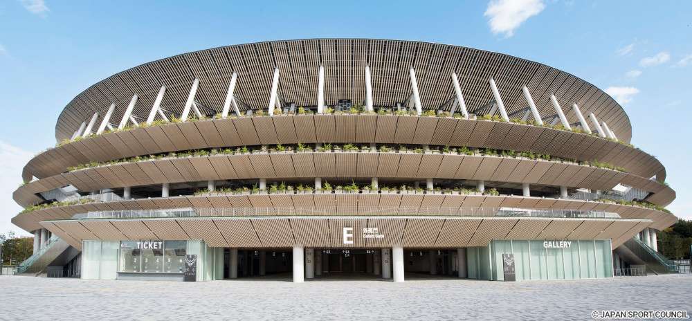
Japanese architects have been at the forefront of this timber renaissance. Kengo Kuma used certified wood from all 47 prefectures in Japan for his iconic National Stadium, the main venue of the 2020 Tokyo Olympics.
The Osaka Expo 2025 Pavilions
And this year, another global event features its own wooden superstructure. The pavilions of the Expo 2025 in Osaka are encased by a 20-meter-high ring that is two kilometers in circumference, making it one of the world’s largest timber structures. Designed by Sou Fujimoto, the ring incorporates wood from the Fukushima areas hit hardest by the 2011 earthquake, tsunami and nuclear disaster.
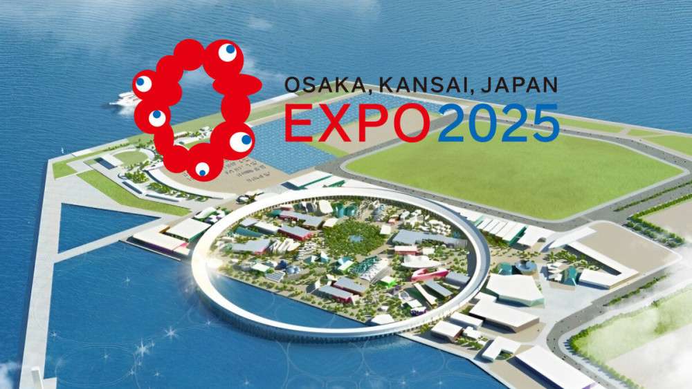
This underscores architecture’s role in fostering social and environmental progress, turning disaster recovery into a global showcase for innovation and sustainability. It also symbolizes harmony, connection, and sustainability to align with the Expo’s theme of “Designing Future Society for Our Lives.”
Engineered wood at this monumental scale and structural integrity uses advanced technologies such as laminated timber (CLT). This combines strength, durability and fire resistance to meet rigorous safety standards for public use. Prefabrication techniques allow structural components to be assembled off-site with precision, reducing waste and construction time.
Port Plus, Yokohama—A Pioneering Case
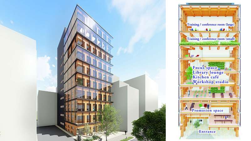
Over in Yokohama, Port Plus is Japan’s first all-timber fire-resistant high-rise building. Built by Obayashi Corp as a training facility for its staff, the first-floor columns, in particular, can withstand a blaze for three hours. Earthquake resistance is also a common point of contention for wooden buildings. But Port Plus achieves high seismic performance by incorporating a seismic isolation structure.
To achieve the same dimensions as a concrete building, the building uses a new method for unifying columns and beams. This includes using rigid joints without steel connection components and newly designed wood joint panels, increasing strength via insertion.
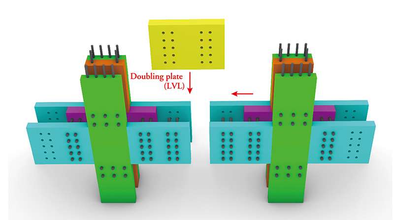
The wood creates a relaxing space, and the lighting, ventilation and scents increase wellness and comfort for visitors. The accommodation rooms’ flooring is made of a new soundproof material. Obayashi claims that Port Plus consumes less than half the energy of a regular comparable building.
Ginza Takagi, Tokyo—A Hybrid Approach
Built along Sotobori-dori in Ginza, the eponymous building by Takagi is a 12-story structure about 56 meters high. The lower eight floors are made of steel, but the upper four floors use wood. This hybrid method offers an alternative for when an all-timber structure is not feasible. Or, for renovating and enlarging existing structures sustainably.
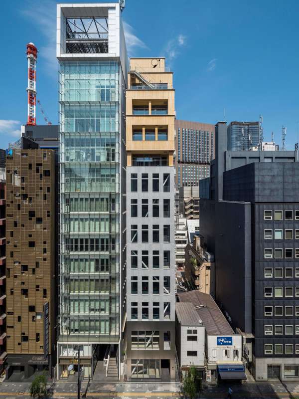
Crafted from certified Japanese cedar from Tokyo’s Tama area, the wooden structure was designed by Tatsuo Yamaji. The architect previously worked at Kengo Kuma & Associates, a leading firm in modern timber architecture. Designed to resemble a wooden box and evoke a sense of warmth, the project aims to add architectural diversity to Ginza’s historic district.
The building features restaurants on the basement and ground floors, retail on the second, offices from the third to eighth, and more eateries on the ninth and tenth. The highlight is a sauna spanning the eleventh, twelfth and rooftop floors, complementing the wooden design.
W350 Plan, Tokyo—A Daring Vision
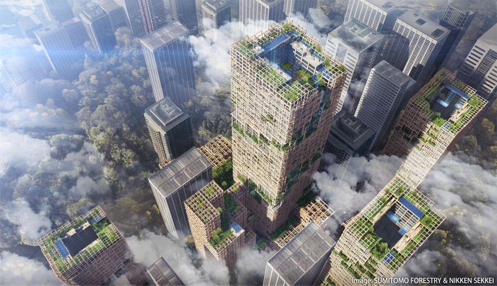
The future looks promising for timber supertall skyscrapers. Nikken Sekkei and Sumitomo Forestry have teamed up to offer an ambitious vision of what such a future could look like with their W350 Plan. While only a research and technological development concept with no actual plans to build it, it’s a bold example of where wooden architecture in Japan might be headed.

The project envisions a city connected to forestry through timber high-rises, including offices and commercial facilities to promote urban environmental sustainability. Plans to recycle leftover timber for smaller buildings and use waste wood as fuel for biomass power generation, on top of the reduction of CO2 emissions during construction, would reduce the global environmental impact.
The 350-meter-tall building itself includes a wooden frame structure 80 meters in diameter. It’s reinforced with steel-embedded wood columns, including some components made of a wood-steel hybrid. Structural frames are covered with renewable wood panels that set the tone for a natural setting, including greenery, wind and natural light, elements usually lacking in conventional skyscrapers.
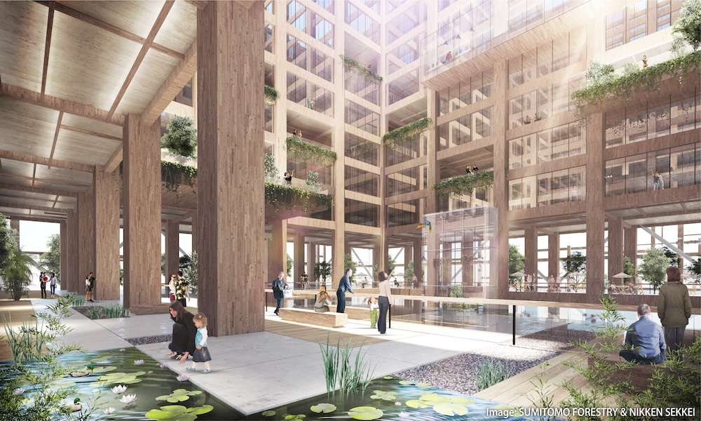
Greenery in particular is a defining feature of W350, with foliage rising from ground level and dotting the structure all the way to the top. The developers envision a city that cultivates biodiversity and allows for small pleasures such as listening to birdsong, feeling the breeze and enjoying the sunlight.
This article originally appeared in the Spring 2025 Issue of Metropolis: “Designing the City.”
Read more:
Seoul Revisited: Finding Retro Japanese Architecture in Korea
