February 6, 2025
The Art of Japanese Plating
A highly codified process that makes food look as good as it tastes
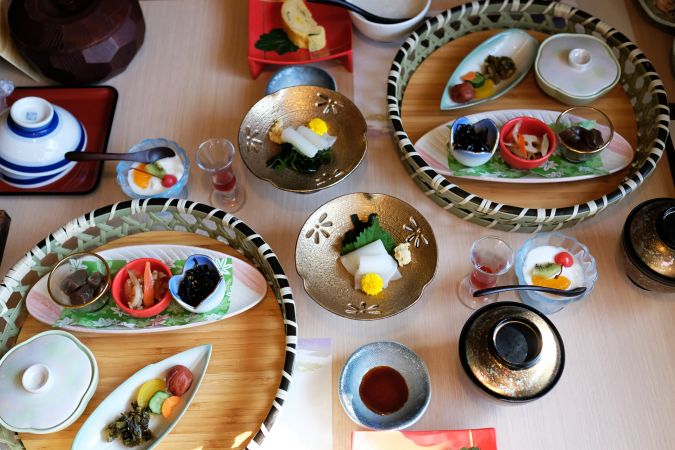
Japanese plating is a highly codified process, interplaying several cultural factors and accepted plating principles. Fundamental to it all is the intention of Japanese cuisine to appeal to the taste and the eye.
For anyone who has relished the delicately complex beauty of a kaiseki (multi-course) meal, wondered why sushi looks particularly attractive in Japan, or tried to plate any meal and make it look half-decent, they may be relieved to hear that the splendor of Japanese plating is not that hard to learn.
Here are several of the key concepts:
Balance of Japanese Plating
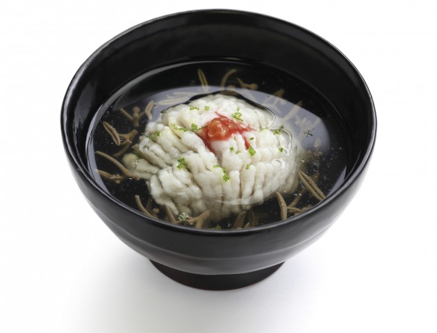
A dish is considered well-harmonized in Japanese cuisine when it feels peaceful to look at. Interestingly, symmetry is not a prerequisite for this, but quite the opposite. A bird’s eye view of a Japanese plate generally shows an off-kilter yet visually pleasing arrangement. Symmetry is predictable, whereas asymmetry is compelling and engaging.
Japanese culture also prizes unevenness in numbers—three, five and seven are found commonly in plating. Five, in particular, is auspicious and is reflected in many facets of Japanese cuisine. The five senses—taste, sight, smell, hearing, touch—are important to a balanced meal.
Meanwhile, chefs interpret the five colors of red, blue (interpreted as green), yellow and white through plating and presentation. Finally, the five tastes—sweet, salty, savory, bitter, sour—are key to balancing flavor. Contrast is also essential to balance color, taste and texture.
Silky, creamy chawanmushi (steamed egg custard) comes topped with popping, briny roe. Bitter Mitsuba greens mix with sweet rice and sour vinegar. Served on a black dish; covered with bright orange and salty grated karasumi (dried mullet roe).
Garnishes like pickled daikon, citrus zest, chirimen (dried whitebait) and bonito flakes, each add contrasting color accents and balance flavor and texture.
Servingware
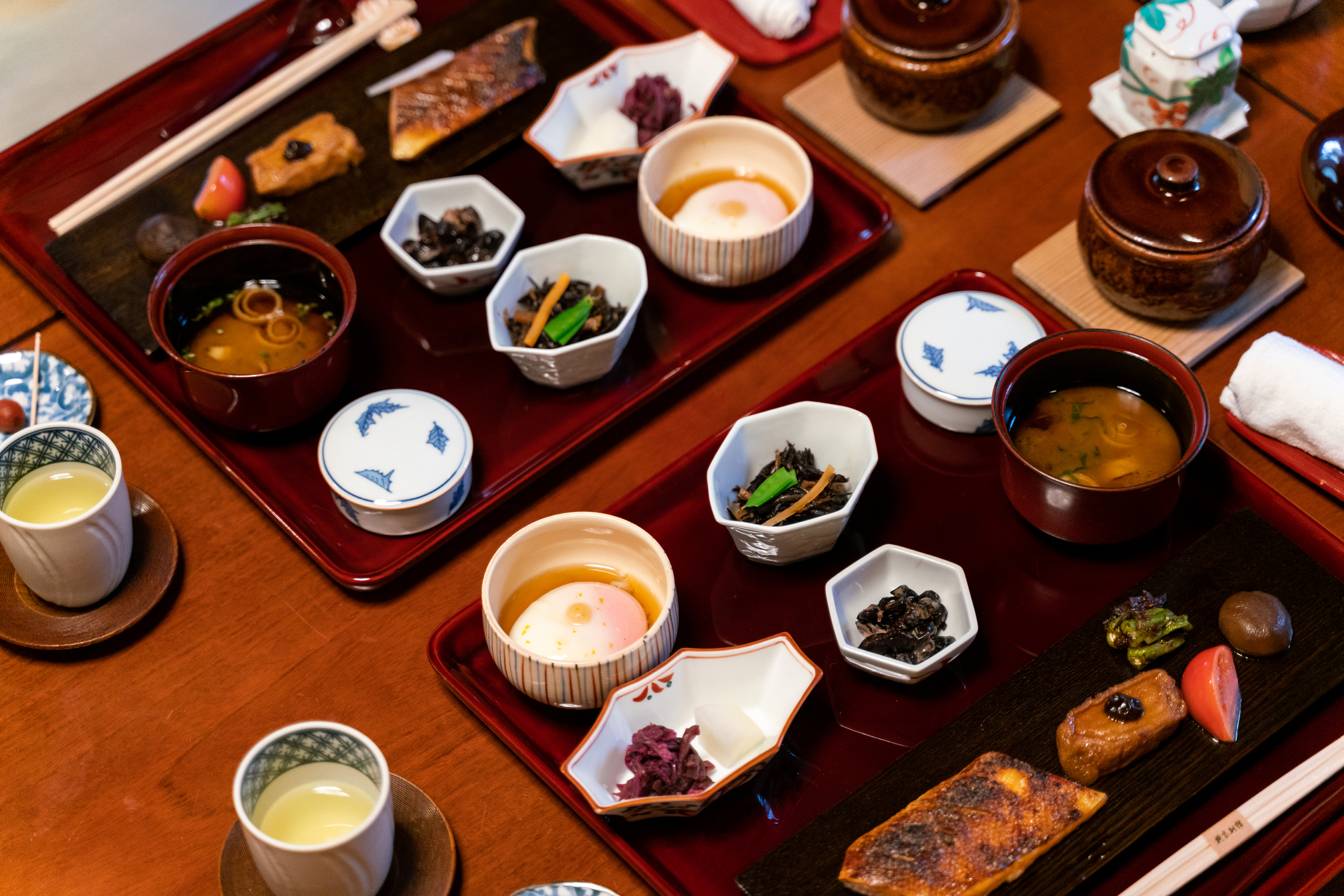
Western restaurants and homes tend to use plain plates, and there is a sense of unity in a ‘set.’ In Japanese culture, it’s the opposite – enjoying the expression of various vessels.
Japanese dishes come in various shapes, sizes and colors. They are made from pottery, glass and lacquer, and are often emblazoned with decorative patterns. The vessels both match and inspire the dish itself. The result is a technicolor kaleidoscope that somehow manages effortless composure. In fact, it is not unlike the vastly contrasting fabrics of a junihitoe (kimono of the ancient Japanese court).
Seasonality
Japan’s staunch allegiance to seasonal eating is unwavering. Each season is a complete scene change on set, from menus to dinner parties, bento boxes, and convenience store shelves.
Plating proudly showcases seasonal produce. Themes of ingredient colors and serving ware for a season—pink and green for spring, reds and gold for autumn. Noodles may come served in large bowls in winter and chilled on top of ice in bamboo baskets for summer. Even chopstick rests provide seasonal cues—a cherry blossom in spring and a maple leaf in autumn.
Empty Space
In Western restaurants, plates are usually piled high and to the edges with food. White space would mark a fine dining establishment. In Japanese dining, plates are rarely fully covered—30% is the minimum space to leave empty. This concept of empty space in Japanese culture is called ma, and echoes through many aspects of Japanese life.
Japanese interior design is famously minimalist, and traditional Japanese painting is often predominantly negative space. Ma is the void between things, an emptiness full of possibilities. In plating, this negative space focuses the diner’s attention as distractions are omitted. It also stimulates a connection from the eye to the palate by providing a sense of intrigue that makes the diner want to find out more.
Japanese Plating Arrangement
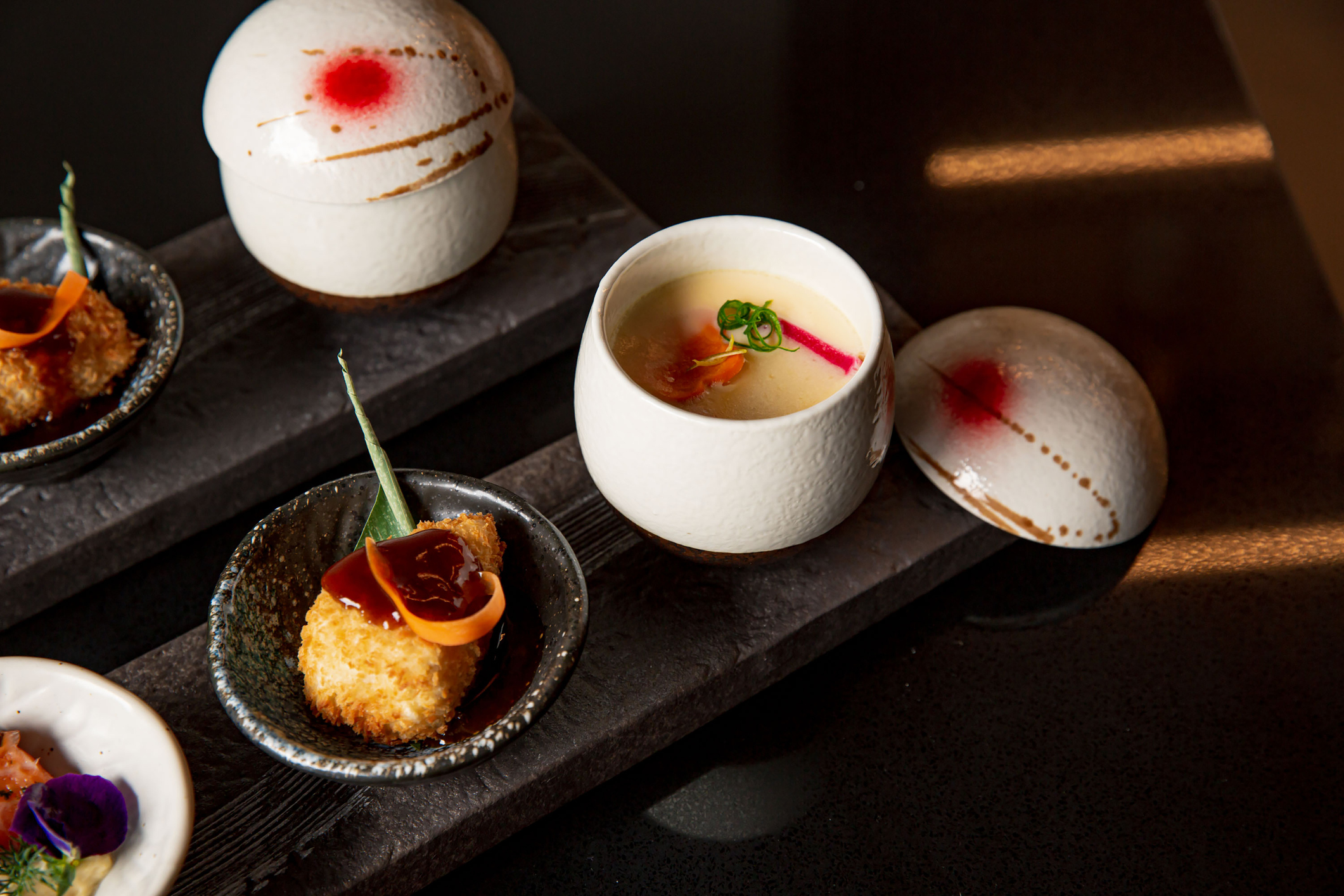
The rules of moritsuke, or serving arrangement, primarily dictate food arrangement at Japanese restaurants. These are a set of styles that draw on the ideas of balance and contrast, underpinned by ma and seasonality.
Here are some of the most common:
- Hiramori is the arrangement of food on a flat plane. Similar sizes and colors of food lay in a slanted direction
- Tenmori is the final touch (using the kanji for ‘heaven’), which provides balance in flavor and appearance
- Yama no katachi is a mounded, mountain-like arrangement
- For sugimori, food is in a conical shape that resembles a cedar (sugi) tre
- Kasane-mori is in a vertically layering arrangement
- Nagashi-mori is a mountain arrangement in a sunken vessel
- Yosemori comprises two or three contrasting ingredients gathered centrally
- Chirashimori is a ‘scattered’ arrangement, thought to be the most difficult as it relies on the ability of chef to balance aesthetics of random arrangements
- Sansui-mori is a landscape arrangement, and may include metaphorical elements such as fanned slices of fish to indicate waves
- Sugata-mori is a ‘figurative’ arrangement where fish or other ingredients are in the shape of the original entity
Each of these principles serves to make Japanese cuisine look as good as it tastes.

