Design Anatomy
A dissection of the products in your fridge
Some of you might remember the film, Honey, I Shrunk the Kids. There is a bit of that at the latest exhibition at 21_21 Design Sight.
Titled “Design Anatomy,” the show takes an in-depth look at several key brands—including yogurt, milk, and a mushroom-shaped sweet snack—and in the process blows their packaging up to enormous sizes, giving one a sense of what it might be to be shrunk to ant size.
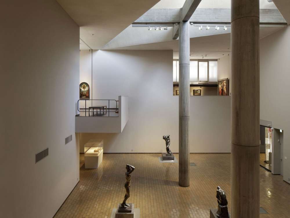
One of the first things that greets you as you descend into the stylish, Tadao-Ando-designed concrete bunker that is 21_21, is a skull of Licca-chan, a popular doll that rivals Barbie in sales in Japan. While I couldn’t help taking it as a kawaii memento mori, its role is supposed to be more positive. It is intended to help designers think more deeply about a product some of us may dismiss as a superficial piece of plastic, and in the process give it a certain “depth” and a back story.
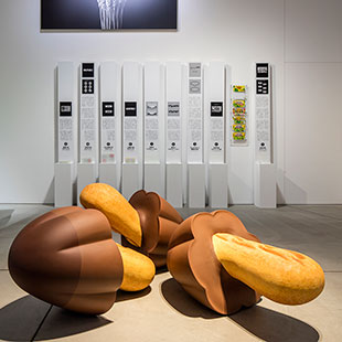
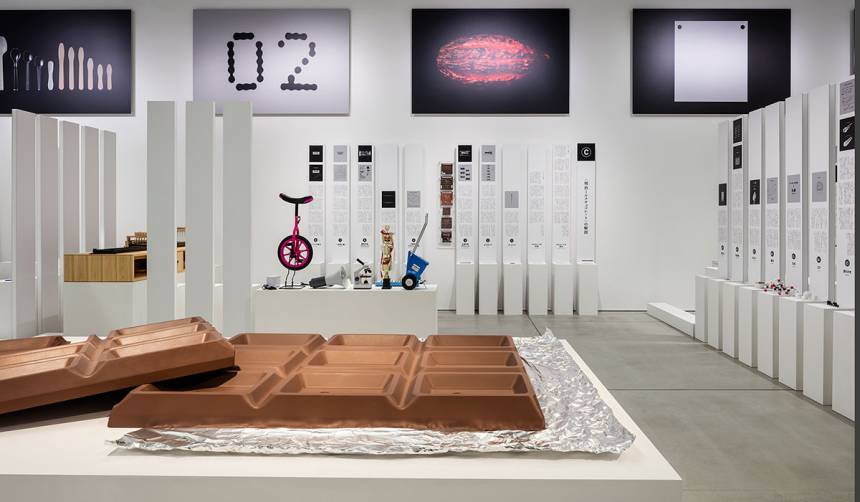
After leaving the doll behind, you encounter what seems like a shrine to Kinoko no Yama (“Hill of Mushrooms”), a mushroom-themed confectionary. The exhibition director Taku Satoh is well-known for his work on various mass market items, and the display here reveals the degree of thought and general all-round pondering that goes into every aspect of the product, from its flavor, look, and texture, to its name, image, and even the typeface used.
While this makes obvious sense when viewed from a business perspective, it makes rather less sense from a layman’s point of view and seems somewhat obsessive. We have 3-D models of the 2-D images used on the packaging, rows of mushroom prototypes, and computer simulations of how different snacks jiggle around in a box. Then there is the giant model and cross section of one of the tiny shrooms!
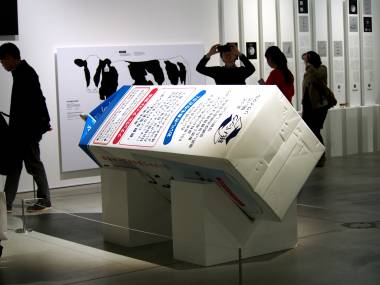
The same treatment is given to ice cream, yogurt, and milk brands, with a giant ice cream tub cut right down the middle and an enormous carton that lies there as if discarded by a lactose intolerant giant, with a cow installation looking on as it is milked.
As the exhibition title suggests, Satoh is applying the idea of dissecting animals to products, to better understand design parameters.
“We instead dissect design, analyzing the graphic elements such as the layout and printing of the logos and packages of the products, and performing detailed analysis and observations of the products’ inner workings,” he writes in the exhibition notes.
This sounds plausible enough, but I found myself thinking that I was getting too much boring trivia. For example, the display for Meiji Bulgaria Yogurt has dozens of spoons, all holding globules of pretend yogurt of supposedly different textures and consistency.
Also, how do we explain the manic supersizing of the packaging? I think the real reason is that it adds a Gulliverian charm to what would otherwise be a very dull show. It was well attended, mainly by design student types. Strangely, though, none of them seemed put off by the show’s apparent message that design is 99.9% perspiration—and tediously trying every conceivable combination—and just 0.1% creative inspiration.