March 30, 2026
Japanese Color Theory: How Japan Sees Color Differently
What a thousand years of Japanese color tradition can teach us about the way we see
A book published in 1933 is seemingly sold out everywhere. Reddit threads are dedicated to tracking down copies. TikTok creators are using it to plan their daily outfits. The title is A Dictionary of Color Combinations by Sanzo Wada, a Japanese artist who spent years cataloging hundreds of color palettes drawn from 1930s avant-garde art, fashion and cinema.
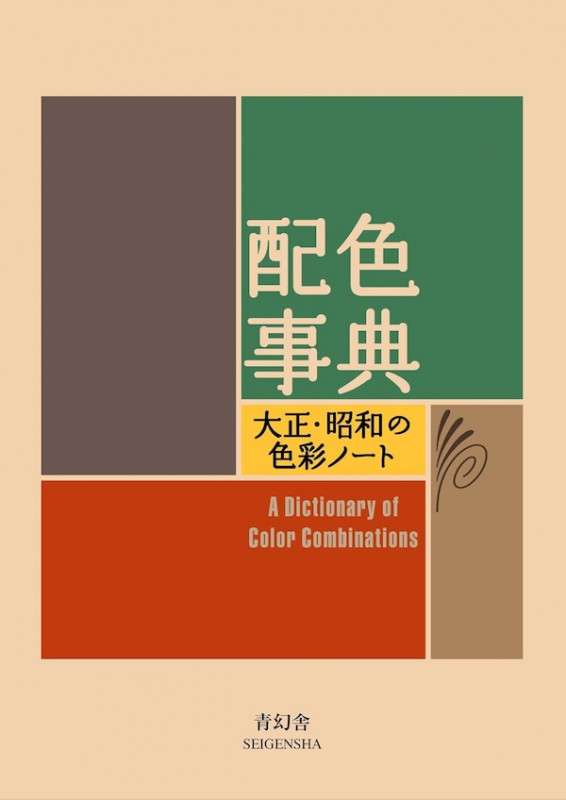
The renewed interest in Wada’s work isn’t entirely surprising in an era of visual overload. His palettes draw on thousand-year-old Japanese color traditions that approach color as something philosophical and intentional rather than attention-grabbing.
Ask anyone what color the sky is, or what color glows at a traffic light, and the answer comes quickly, confidently, as if it were simply a matter of looking.
But color has always been as much a construction as an observation. The wavelengths are fixed; what we make of them is not. Languages and traditions assign different meanings, hierarchies and emotions to the same hue. What reads as mourning in one place is celebration in another.
What one language sees as two distinct colors, another has always understood as one. In Japan, that traffic light you’d call green? It’s officially ao—the same word for blue.
In Japan, color has never been purely a matter of optics. It’s seasonal, philosophical and deeply tied to a sense of impermanence that runs through the culture like a thread. To understand how Japan sees color is to understand that the way you’ve always seen it isn’t the only way—and that might be the most interesting thing color theory ever taught anyone.
@parkeryorksmith These color combos never disappoint
Where It Begins: The Four Ancient Colors
The earliest written history of Japan mentions four ancient color terms in the Japanese language: aka (red), kuro (black), shiro (white) and ao (blue). But these may not have been color words in the way we use them today, rather that they originally described sensory contrasts rather than hues: light versus dark, clear versus hazy. The traces are still visible: kuro shares a root with kurai (dark), and aka is related to akarui (bright).

From there, color in Japan became political. The Twelve Level Cap and Rank System established in 603 by Prince Shotoku assigned specific hues to specific ranks—korozen, a deep reddish-brown, for the Emperor alone; murasaki, a rich purple, for the highest court nobility. Certain colors were strictly forbidden to anyone outside these circles in a system known as kinjiki (禁色), or “forbidden colors.”
The Five Elements and Goshiki
Much of this early color logic was inherited from China’s philosophy of yin and yang and the five elements, introduced to Japan over a thousand years ago and still visible today through its connection with Shintoism. Each element was assigned a corresponding hue, known collectively as goshiki: red to fire, green (or blue) to wood, yellow to earth, white to metal, and black to water.
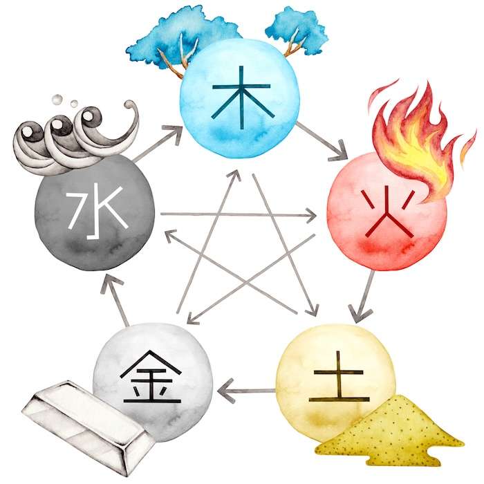
These correspondences extended far beyond color itself. Each element also represented a geographical direction, virtue, season and sense. Yellow wasn’t just a hue, it was earth, center, fidelity and the heat of midsummer. To choose a color was to invoke a worldview.
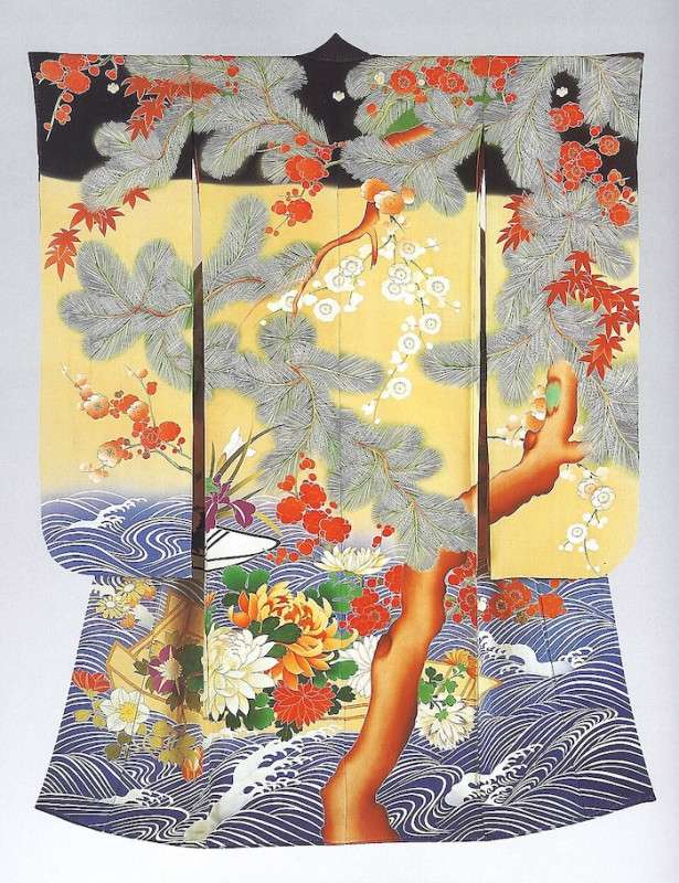
The Heian Period: Color as Poetry
The Heian Period (794–1185) is considered the peak of the Japanese imperial court and is known for its art, especially in poetry and literature. Many color names and descriptions survive through the pages of traditional works like The Tale of Genji.
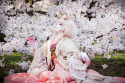
It was during this era that Japanese color culture reached one of its most remarkable expressions: kasane no irome (襲の色目), or “layered colors.” The color combinations of women’s court robes, worn in layers, were named for the season they belonged to, and crucially, they were not meant to reproduce the exact colors of nature, but to reproduce the feeling of a season.
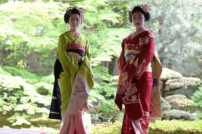
More than 260 named combinations existed. A woman was judged by her choices, the way a poet might be judged by their metaphors. Aristocratic women spent much of their lives behind screens and fans; it was through the deliberate trailing of layered sleeves and hems that they made themselves seen. Color, here, was communication without words, a measure of taste, intelligence and status all at once.
The Blue-Green Mystery
Many languages have had periods during which blue and green overlapped in a single word. In Middle English, it was hœwen, and in Japanese, it was (and sometimes still is) ao (青). While no one uses hœwen anymore, ao has never fully let go of its green overlap. Today, Japanese has a distinct word for green, midori, and uses it for almost everything. Almost everything…fresh vegetables, seaweed, young leaves and traffic lights are still ao.
The explanation traces back to the language’s origins. In Old Japanese, ao referred broadly to “young,” “fresh” and cool hues in the green-blue range and was a concept tied to feeling and association rather than definition. It survives in words like seishun (青春), literally “blue spring,” a term for the vibrant, emotional and sometimes fleeting experience of youth.
The Edo Period: Constraint as Creativity
During the Edo period (1603–1868), laws limiting silk and certain colors among the merchant and working classes produced one of Japanese color history’s most counterintuitive chapters: prohibition generating sophistication. Townspeople cultivated an extraordinary vocabulary of subtle browns and grays, so refined it earned the description “forty-eight browns, a hundred grays.”
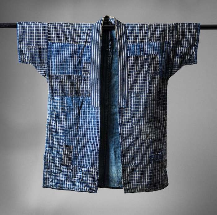
Then there was indigo, ai (藍), which exploded in popularity as commoners discovered how easily it took to cotton and it became the color of everyday life. The dye itself proved to have antibacterial and insect repellent properties, making it as practical as it was striking.
Its depth ranged from pale asagi to near-black kachi-iro, and its ubiquity eventually inspired British chemist R.W. Atkinson to coin the term “Japan Blue” during a visit in the 1870s—a name that has stuck in fashion, sports and pop culture ever since.


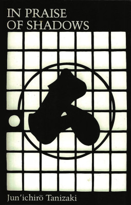
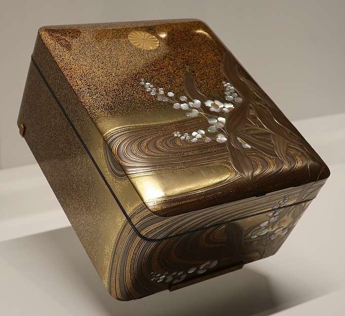
Tanizaki and the Beauty of Shadows
No discussion of Japanese color would be complete without Jun’ichiro Tanizaki, whose 1933 essay In Praise of Shadows is still one of the most important texts ever written on the subject.
Tanizaki argues that Japanese architecture and design are built around the interplay of light and shadow, and that meaning emerges from what is partially concealed rather than fully revealed. Objects deepen with use, their surfaces telling the story of the years rather than hiding it.
A lacquered bowl by candlelight is a different object from the same bowl under a fluorescent tube. Essentially, the Western preference for brightness, full visibility and saturation reveals everything, whereas the Japanese aesthetic holds that what is partially hidden and is often more beautiful than what is fully seen.
It would be too simple, though, to frame this as a fixed cultural trait. Urban Japan is as saturated with neon, fluorescent lighting and high-contrast advertising as any modern city. The sensibility Tanizaki described often lives on in traditional crafts, architecture, seasonal rituals and quiet corners of daily life, coexisting with a modern visual culture.
What’s interesting is that Wada’s book, written in that same era as Tanizaki’s essay, is now finding its audience precisely because people are hungry for something that neon cannot provide: color that feels meaningful and complex.
This is wabi-sabi made visible, made of a palette that is impermanent and organic, like the grey of ash, the brown of aged wood or the faded indigo of a textile washed a hundred times. Its imperfection is a quality to be read.
Japanese Color Theory in Practice: Two Palettes
Japanese color theory shows up in specific combinations, contrasts and moods. Here are two examples drawn directly from its traditions:

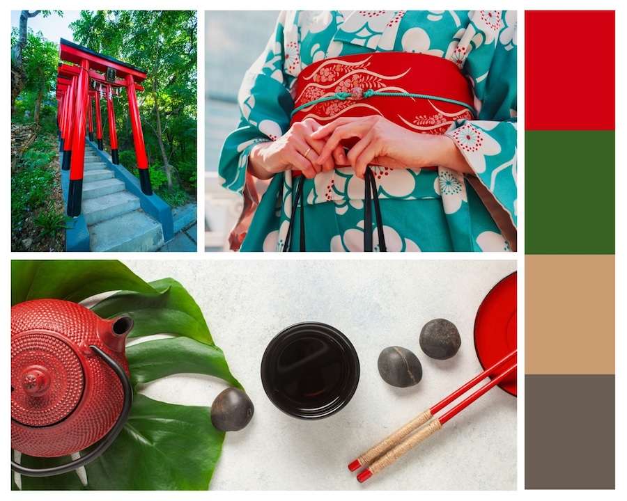
Torii Gate — Deep vermillion red, indigo blue, forest green and antique gold. The red of a torii gate against the surrounding cedar and pine, the indigo of a night sky reflected in still water, the gold of lantern light.
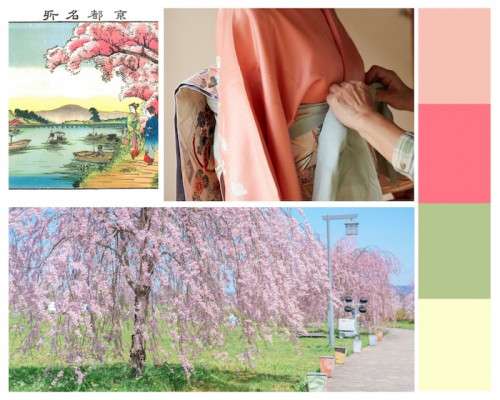
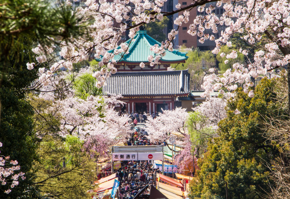
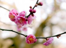
Hanami—Blush pink, soft sage, pale celadon and warm cream. The colors of cherry blossom season: petals against new leaves, morning light through thin clouds.
What Japanese Color Theory Means Today
The recent popularity of Sanzo Wada’s book is, in its own way, a form of cultural longing. In a visual landscape dominated by high saturation and algorithmic attention-grabbing, Japanese color theory offers something genuine and emotional. It asks not what a color means, but what it feels like. Wearing the colors of pink cherry blossoms is more than just “pretty”; it acknowledges that beauty is temporary, that the blossoms will fall, and that this is precisely what makes them worth seeing.
Learn more about Japanese aesthetics:
Japandi: The Fusion of Japanese Minimalism and Scandinavian Comfort
The Japanese Aesthetic of Transparency: From Hokusai to Pocari Sweat